 The Women’s Chorus of Dallas wanted a new logo to reflect a new era for the group – something a little more modern and clean in style. The goal was something that wasn’t screaming “women” while reflecting the mission of the group.
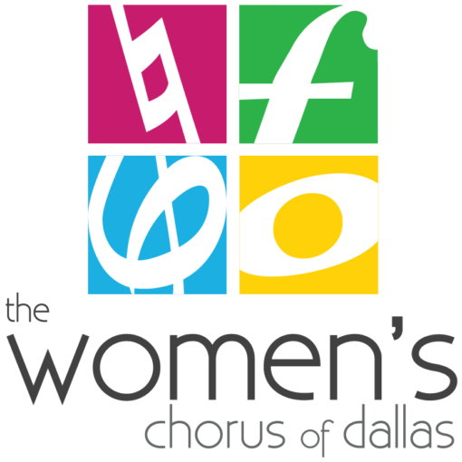
I kept the previous colors and the kind of grid design using them. The previous logo had them as four cursive letters “TWCD”.
Instead of letters, I went with music symbols to fill the boxes. These specific ones were selected for their symbolism – natural, strong, women, whole – to tell the story of chorus as well as make it obvious at first glance that it’s a musical group.
Logo was done in a square and horizontal version as well as single color. It’s been in use by the chorus since 2011.
 Tarot Card Deck Mockup
  Pizza Truck
  Bus Bench Ad