 Updated in 2018!!!
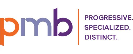
The firm wanted to make some further changes and updates to the brand that would allow them to grow and change and bring in new business lines. They still loved the color palette, so that definitely was staying, but we were dropping the two names and sticking with PMB going forward. The decision was also made to develop a tagline, leave off “accountants” and remove the arrow from the logo design and overall brand style.
I kept the same font used previously, shifting to lowercase letters and tweaking them to all have the little cutouts and to create angles on the descender and ascender. The logo is used with the tagline in either purple or orange, but most often without the tagline at all. The tagline brought in a new font, which is also used in general text on business cards, etc.
 My accounting firm client was looking to rebrand itself, starting with a change to the logo. The goal was something unique and modern that reflected a more progressive mindset.
After a lot of idea tossing, it was decided to focus on an arrow as a core part of the design to illustrate forward-thinking. I developed a color palette of purple and orange to reflect knowledge and personality. The secondary palette included three shades of purple, one orange and two grays. The tertiary palette included yellow, green and blue for accents in design.
I worked with the business development director and a team of accountants to develop ideas into the final choice.
 Tarot Card Deck Mockup
  Pizza Truck
  Bus Bench Ad